About me.
Thank you for your visiting my websiteI'm Marloes, a UX and UI Designer with a passion for creating exceptional digital experiences. My journey in the design industry began when I was studying graphic design in college. While working on projects, I became fascinated with the process of designing digital interfaces and how they could be optimized for the best user experience.
After graduation, I landed my first job as a junior designer at a small company where I honed my skills in UI and UX design. It was there that I realized my true passion for creating interfaces that not only looked great but also functioned seamlessly for the user.
As I gained more experience, I decided to branch out on my own and become a freelance designer. This decision has allowed me to work with a variety of clients and industries, from small startups to established businesses. I pride myself on my ability to understand the unique needs of each client and their target audience, and then use that knowledge to create engaging and intuitive interfaces.
Throughout my career, I have worked on numerous projects, ranging from website redesigns to mobile app design. One of my most memorable projects was a user-centered design process for municipalities, where I designed a way to share credentials with Privacy by design in mind.
I worked closely with the development team and the client to create a modern and intuitive interface that resulted in a significant increase in conversion rates and user engagement.
Overall, my passion for UX and UI design has allowed me to create meaningful and impactful digital experiences that make a difference for both clients and users. I am always eager to take on new challenges and help businesses achieve their goals through design.
Services
I'm a UX and UI design professional that offers services that range from user research and wireframing to visual design and prototyping, to create effective and engaging digital experiences.
UX Research
Effective UX research in combination of quantitative and qualitative methods, including user interviews, surveys, usability testing, and analytics.
UI Design
The creation of user interfaces that are visually appealing, intuitive to use, and align with the brand identity and user needs.

Usability testing
Usability testing by evaluating a product's user interface by observing users performing tasks to identify areas for improvement and enhance overall user experience.

Graphic design
Graphic design to create appealing illustrations, animations and video’s that enhance the seduction and persuasion of products.
Skillset
An experienced designer with expertise in advanced technology tools and software
Figma

Sketch

Miro

JIRA

Protopie

Adobe

Photoshop

Adobe XD

Indesign

Illustrator

After Effects

Premiere

Gitlab

Lottie

Figma

Sketch

Miro

JIRA

Protopie

Adobe

Photoshop

Adobe XD

Indesign

Illustrator

After Effects

Premiere

Gitlab

Lottie
Testimonials
My referencesJesse van Muijden
Owner at Van Muijden IT
Marloes was an invaluable member of the team responsible for developing Ketting.io. She was highly pro-active in the UX research phase, scheduling live interviews and calls with key users from the broad target audience. She completed a full service design. The developers in the team were particularly pleased with the UI design that respected the Material design constraints of the Vuetify framework. At the same time, she suggested creative ideas for groundbreaking new UI components that turned out to be crucial to make the Ketting.io application really stand out. She frequently validated the designs with the client, which helped the team converge toward the final product efficiently. Thanks to Marloes we exceeded our client's expectations.
Projects
Portfolio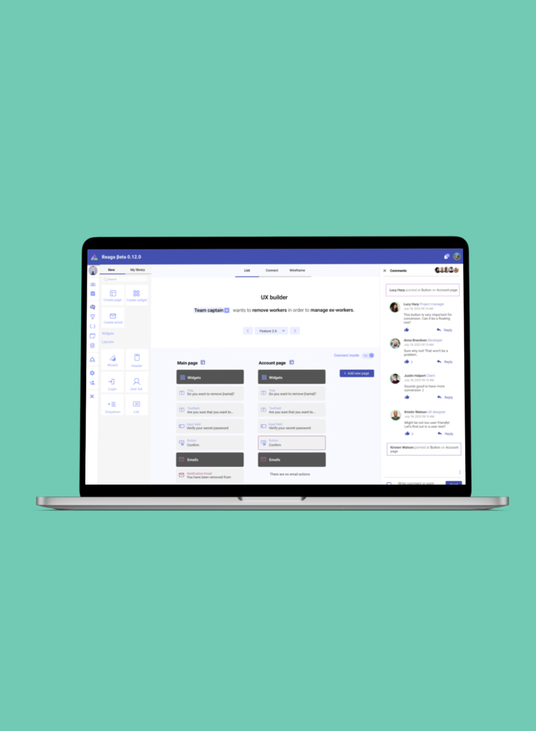
read more
Reaga
read more
Atechnology website
read more
Taber Industries
read more
Volkswagen Passat
read more
Ketting.io
read more
Bouwcenter
read more
Breek
read more
WieDoetWat
read more
Histoury
Reaga
Service Design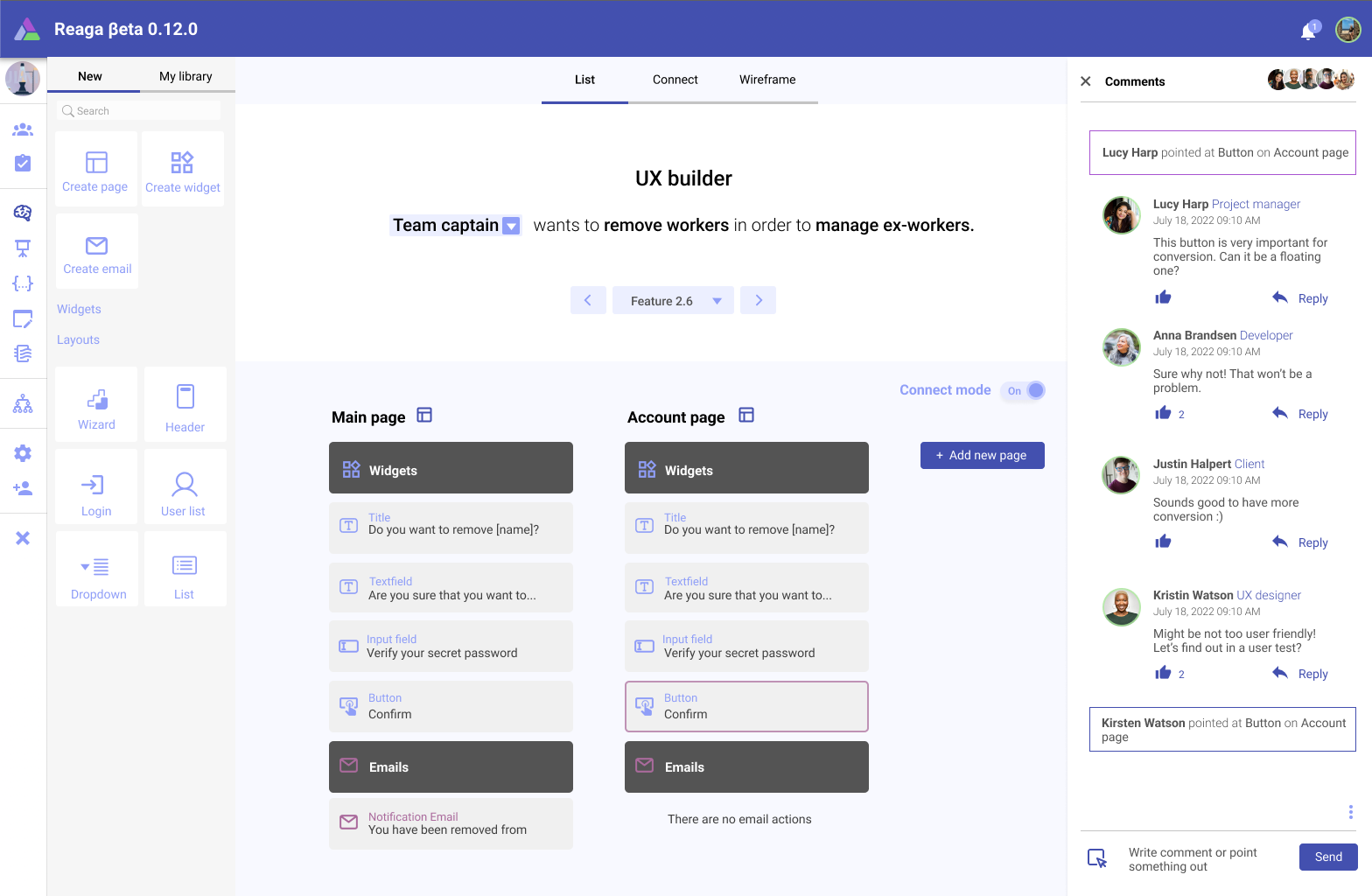
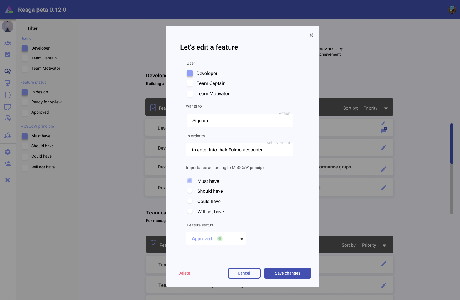
Reaga - the SaaS platform that enables companies to create UX-brainstorms, user stories, wireframes and requirements in a single, easy-to-use platform.
The idea for Reaga emerged while I and the company owners were working on other projects, and we discovered that many clients struggled with the design process. We realized that there was a real need for a platform that could streamline the process and make it more efficient.
I worked closely with two developers to turn this idea into a reality. We conducted extensive research and user testing to ensure that the platform would be intuitive and user-friendly. We also identified key features that would provide the most value, such as collaboration, project management, and design efficiency.
Throughout the development process, I had daily meetings with the team and developers to ensure that the platform was on track and that any issues were resolved quickly. We also worked closely with beta testers to gather feedback and make any necessary adjustments.
Now, as we approach the final stages of development, I am excited to showcase Reaga in my design portfolio as a testament to the power of service design. Our team has worked tirelessly to create a platform that helps companies streamline their design process and make it more efficient, and we are confident that it will make a real difference for our clients.
Over the past year, I have dedicated myself to creating a large and sophisticated platform that is now ready to be built. This project has been my most challenging yet, but it has also been one of my most rewarding.The platform is designed to provide a range of services to users, from project management to collaboration and communication tools.
From there, I began conducting extensive research, talking to users and other designers, and brainstorming with my team. We wanted to create a platform that would be intuitive and user-friendly while also providing a wide range of tools and features.
After many months of planning and designing, we finally had a solid plan in place. I worked with a team of developers and engineers to build the platform from the ground up, ensuring that it was scalable, secure, and optimized for performance.
Throughout the development process, I worked closely with the development team, providing guidance and feedback on the design and functionality of the platform. I also conducted extensive user testing to ensure that the platform was meeting the needs of our users.
Now, after almost one year of hard work, the platform is ready to be built. It has been a long and challenging journey, but I am proud of what we have accomplished. This project has allowed me to showcase my skills as a designer and has taught me the importance of perseverance and dedication in achieving my goals. I am excited to see the platform come to life and make a real difference for our users.
As the only UX designer in the team, my role was definitely a senior position where I coordinated all the user experience design processes by myself.
Technology Figma, Illustrator, JIRA, GitlabYear 2022 - 2023Atechnology
Corporate Website Redesign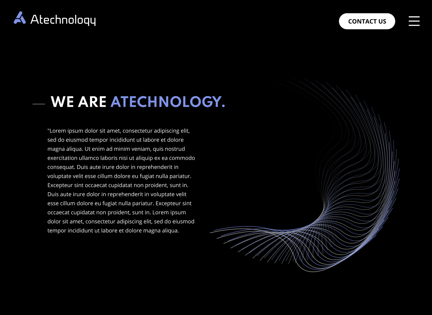
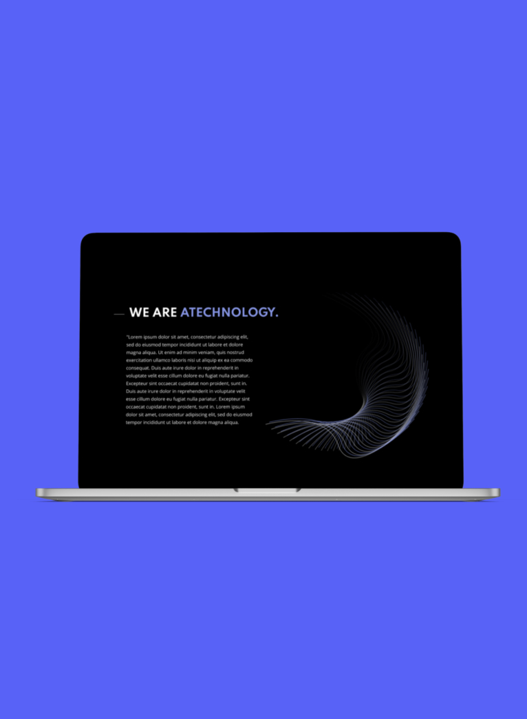
During my first half year at my UX-design job at Atechnolgy, the company owners asked me for a redesign of their company website. As a UX/ UI designer, I had experience in creating stunning websites that were user-friendly and conversion-focused. I was excited to work on this project as the company’s focus on embedded engineering fascinated me.
I started the redesign process by conducting a thorough analysis of the current website's strengths and weaknesses. Based on my findings, I recommended a complete overhaul of the website's branding, UX, and UI design. The company agreed, and we began the design process.
I created a new branding strategy for the website, including a new logo, color scheme, and typography. The goal was to create a modern and professional look that reflected the company's expertise in embedded engineering.
Next, I focused on the user experience design. I conducted user research and created user personas to understand the target audience's needs and pain points. Based on the research, I created a user journey map and wireframes that focused on delivering a seamless user experience. The design included clear call-to-actions, easy navigation, and quick access to relevant information.
During the UX design phase, I identified an opportunity to add a new feature to the website that would help persuade potential clients to choose Atechnology.com. The feature involved allowing clients to upload their existing offers from other companies, and in turn, receive a better offer from Atechnology.com.
Finally, I began working on the UI design. I created a modern and clean design that emphasized the brand's new color scheme and typography. To add an extra layer of appeal, I created multiple Lottie animations that added a stunning and mesmerizing appeal to the website.
I worked closely with the development team to design and implement this feature, which involved creating a form for clients to upload their offers, a backend system for reviewing the offers, and an algorithm to generate new offers based on the information provided.
The redesigned website was launched and received positive feedback from both the client and their customers. The new branding, UX, and UI design improved user engagement, enhanced user experience, and increased customer conversion rates.
Technology Branding, Redesign, UI design, Micro InteractionsYear 2022Taber Industries
UI Design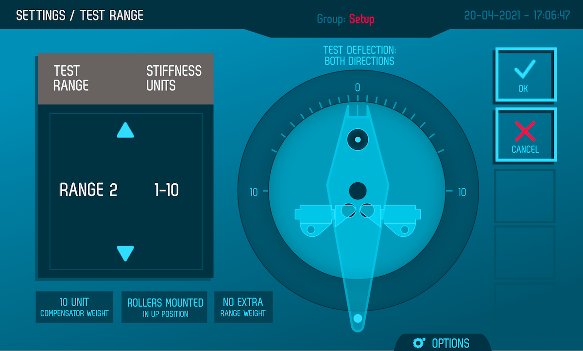
Taber Industries is a leading manufacturer of precision testing equipment for the materials industry. Their product line includes a range of instruments for measuring the physical properties of various materials such as plastics, metals, textiles, and coatings.
Two of Taber's most popular products are the Stiffness Tester and the Abraser. The Stiffness Tester is a device that measures the rigidity and bending properties of materials, including paper, cardboard, and plastics. This instrument is widely used in the packaging and paper industries to ensure the quality and consistency of their products.
The Abraser, on the other hand, is a machine that measures the abrasion resistance of materials, such as paints, coatings, and plastics. This equipment is used to simulate wear and tear on a material and is commonly used in the automotive, tech and aerospace industries to test the durability of their products.
Overall, Taber Industries is a trusted name in the materials testing industry, and their Stiffness Tester and Abraser are just two examples of their innovative and reliable testing equipment.
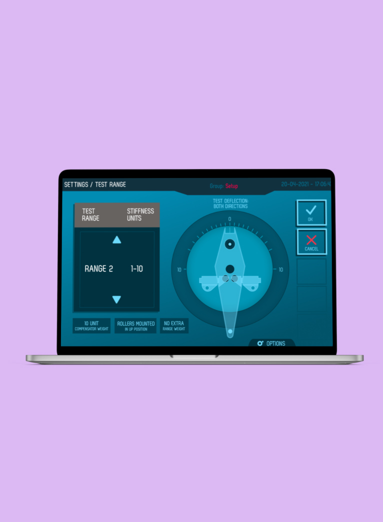
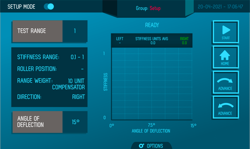
As a UI/UX designer for ATechnology, I had the opportunity to design the user interfaces for Taber’s Stiffness Tester and Abraser based on functional requirements. Using my expertise in user-centered design principles, I developed intuitive interfaces that made it easy for users to operate the testing equipment.
Moreover, I was able to contribute to the development of these products by suggesting and implementing new functionalities that would enhance their capabilities. By understanding the needs of the users and the testing requirements, I was able to create new features that made the Stiffness Tester and Abraser more versatile and effective.
My work in designing these user interfaces and adding new functionalities has been instrumental in helping Taber Industries maintain its position as a leader in the materials testing industry. It showcases the power of collaboration between design and engineering, highlighting how innovative ideas can lead to the development of better products, ultimately making a significant impact on the end-user experience.
To ensure that the user interfaces for their products were tailored to the needs of their customers, Taber Industries collected insights from their user base. As a UI/UX designer, I played a crucial role in turning these insights into actionable design solutions for their mobile touchscreen enabled device.
Through user research and testing, we identified pain points and areas where users were struggling with the existing interfaces. We also gathered feedback on desired features and functionality that would improve their testing experience.
I then utilized this feedback to create intuitive and user-friendly interfaces for Taber's mobile touchscreen enabled device. By incorporating features that were specifically requested by users, such as improved navigation and easier data input, we were able to create a more efficient and effective testing experience.
This collaborative process between Taber Industries and their customers, along with my design expertise, resulted in a successful product that met the needs of their users. It highlights the importance of user-centered design principles and the value of gathering insights from customers to create products that meet their needs and exceed their expectations.
To gain a deeper understanding of the context and technical requirements of Taber's products, I joined weekly tech sessions with the engineering team. This allowed me to have a better understanding of the testing processes and how the equipment functioned.
During these sessions, I gained valuable insights into the technical aspects of the Stiffness Tester and Abraser, which helped me design the user interfaces more effectively. It also allowed me to understand the engineering constraints, and what could be done to improve the overall user experience while still maintaining the equipment's functionality.
By participating in these sessions, I was able to identify opportunities for user interface improvements, suggest new features, and collaborate with the engineering team to make sure that the interfaces would work seamlessly with the equipment.
This collaborative approach enabled me to design interfaces that not only met the needs of the users but also fit within the technical requirements of the equipment. The resulting user interfaces were intuitive, easy-to-use, and streamlined the testing process, ultimately improving the overall user experience.
Technology Interaction Design, Product DesignYear 2022Volkswagen Passat
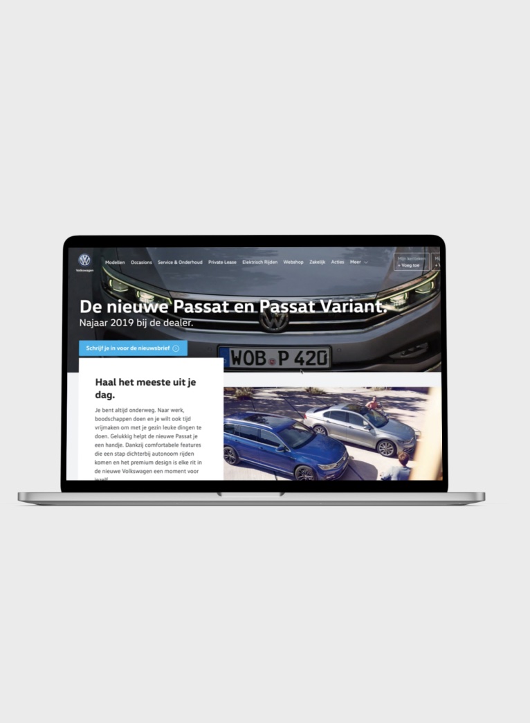
Landing PageDuring my internship at Valtech Utrecht, I had the opportunity to collaborate on the design of a webpage for the Volkswagen Passat. The project was commissioned by Volkswagen Netherlands and involved creating a landing page that showcased the features and benefits of the Passat model.
My role in the project was to work closely with the senior UX designer and the development team to create a design that was both visually appealing and functional. I began by conducting extensive research on the Passat and its target audience, identifying key features and benefits that would appeal to potential buyers.
From there, I worked with the UX designer to create wireframes and mockups of the landing page. We wanted to create a design that was simple and intuitive, with clear calls-to-action and engaging visuals. We also ensured that the page was optimized for mobile devices, as we knew that many users would be accessing the page from their smartphones.
Throughout the design process, I collaborated closely with the development team to ensure that the design could be implemented effectively. We discussed technical specifications and made adjustments as needed to ensure that the page was both functional and visually appealing.
Once the design was finalized, I worked with the senior art director ensuring that the final design would meet the needs of Volkswagen Netherlands and its target audience.
In the end, the landing page for the Volkswagen Passat was a great success, receiving positive feedback from both Volkswagen Netherlands and its customers. This project allowed me to showcase my skills as a designer and taught me the importance of collaboration and communication in achieving a successful design.
Technology Adobe Creative Suite, Sketch, ProtopieYear 2019Ketting.io
Gemeente GroningenTry out the prototype here.
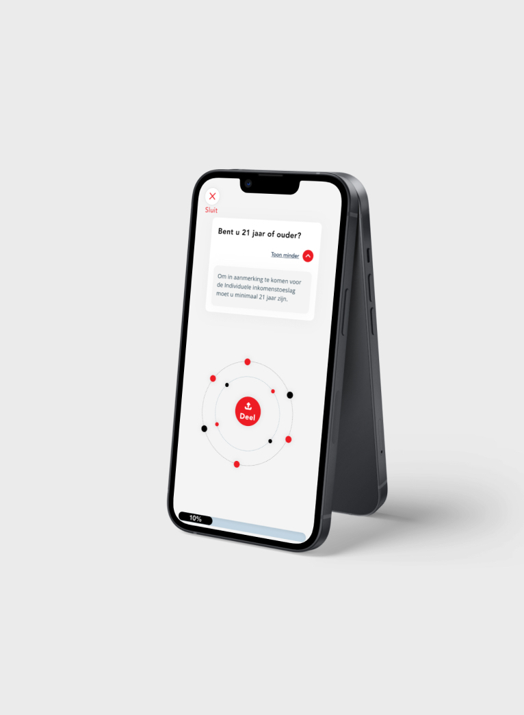
During my Graduation Internship,I was tasked with creating an innovative blockchain solution that would enable secure sharing of verified credentials for welfare applicants in municipalities in the Netherlands, specifically for Gemeente Groningen and executed for ‘Het Inlichtingenbureau’. To start, I conducted extensive research to understand the needs of the stakeholders involved, including the municipalities, welfare applicants, and institutions responsible for verifying the credentials.
During the user interviews, I discovered that many welfare applicants were reluctant to talk about their low money situation, as it was a sensitive and embarrassing topic for them. They also felt that the current system was cumbersome and time-consuming, which made it difficult for them to apply for welfare benefits. To address these insights, I designed the blockchain-based solution to be as simple and efficient as possible, while also incorporating privacy by design principles to ensure that personal data was kept private and secure at all times.
To design the user interface for this solution, I focused on creating a simple and intuitive design that would be easy for all stakeholders to use.
I worked closely with the development team to ensure that the user interface was optimized for blockchain technology. During the usability testing, I observed how the low-literate users interacted with the digital wallet and the process of sharing their verified credentials with the municipalities. Based on their feedback, I made several design improvements to make the user interface more intuitive and user-friendly.
The final solution I designed was a success, as it has the ability to improve the trust between the municipalities and their citizens.To ensure that the final solution was not only functional but also aesthetically pleasing and easy to use, I spent a lot of time editing the text and layout to make it more readable. I also used a custom-designed visual language that included unique illustrations and micro-interactions that made the interactions more clear for the end-user.
The custom-made illustrations were designed to be simple and easy to understand, using bright and contrasting colors to draw attention to key elements of the interface. The micro-interactions were designed to provide visual feedback to the user, making it clear when an action had been completed successfully.
When the final product was released, we received a lot of positive feedback from welfare applicants, who praised the design for being easy to use and intuitive. They also appreciated the custom-made illustrations and micro-interactions, which made the process of sharing verified credentials more clear and understandable.
Overall, the combination of careful text and layout editing, along with custom-made illustrations and micro-interactions, contributed to the success of the final solution. By taking the time to design a solution that was both functional and aesthetically pleasing, we were able to improve the user experience for all stakeholders involved.
This project was completed during my graduation internship as a designer and I was proud to have played a key role in creating a positive impact on the welfare applicants, municipalities, and institutions involved. This project was conducted as a Proof of Concept.
Technology Figma, ProtoPie, Sketch, Adobe Creative SuiteYear 2020 - 2021Bouwcenter
Sensum Webdesign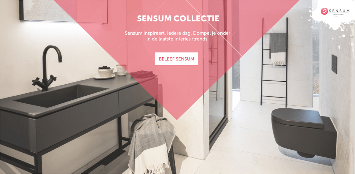
Technology Adobe Creative Suite, Sketch, ProtopieYear 2019Breek
Immersive Media DesignIn the first half of my fourth year, I followed the Immersive Media Design minor at the HAN in Arnhem. In the second block of the minor, we had the Multidisciplinary Project. In this project, I collaborated with four other students from the Mobile Application Development and Manage and Design E-Business minors. Our client was Shani Mooijman, a psychology lecturer at the HAN in Nijmegen. Our task was to design and develop a product that would encourage teachers to lead a healthier lifestyle and be more fit in the classroom by challenging each other.
During the project, we used Design Thinking. In the Research phase, we conducted research through a survey, interviews, and literature review. Our research showed that many teachers at the HAN did not take breaks during their workday. Literature research revealed that working during breaks could lead to decreased well-being, poorer sleep, and worsened mood. Physical distance from work leads to better mood, greater life satisfaction, and a reduced risk of burnout. With these insights, we decided to design and develop a product that would activate and motivate teachers to take (more) breaks.
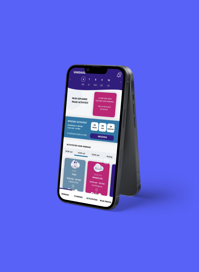
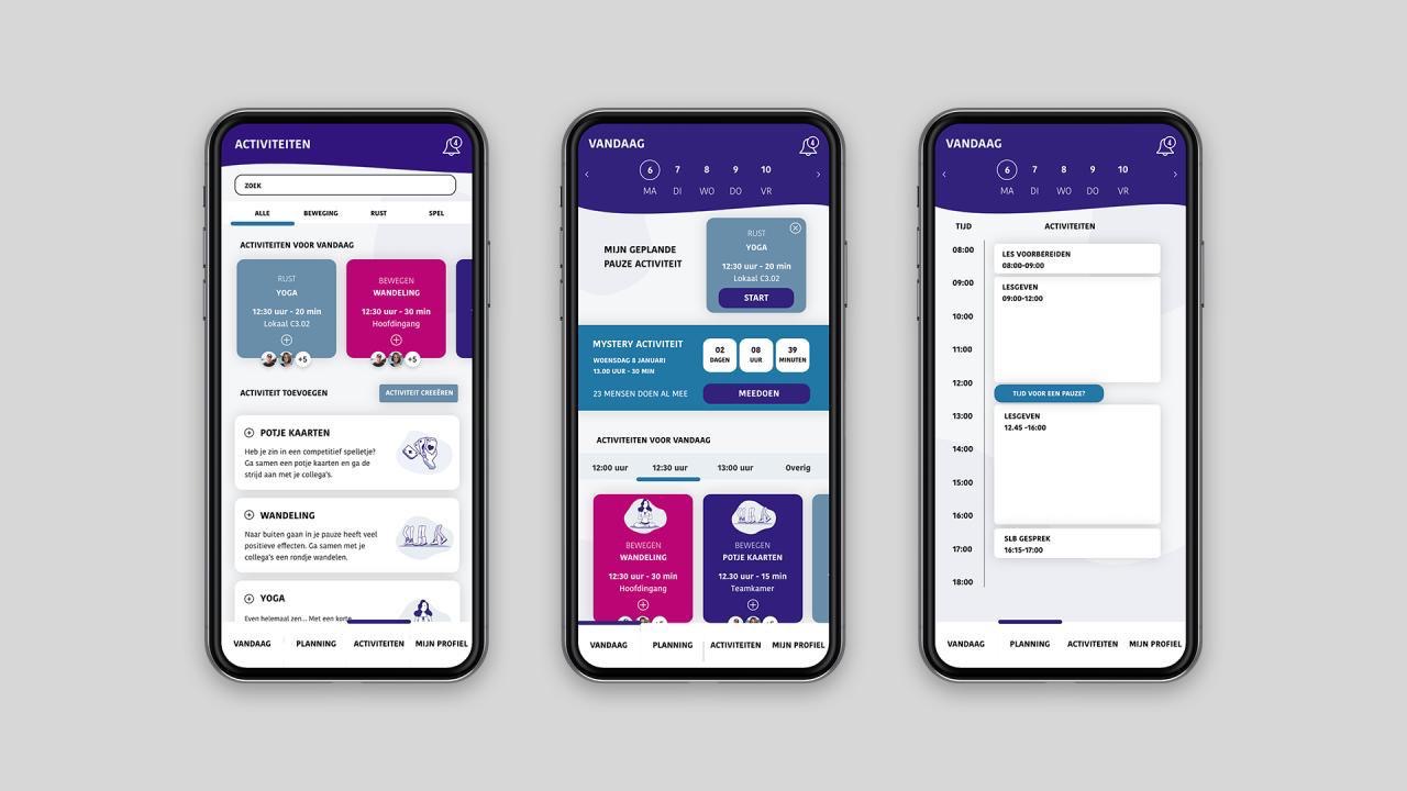
During the project, we designed and partially developed an application called Breek, which motivates and activates teachers to take more breaks by undertaking activities together during breaks. In the above video, you can see the designed application.
Breek offers activities that teachers can do together. The application takes into account personal (work) schedules and interests, making it easy to plan break times. Therefore, Breek stimulates teachers to take more breaks.
To develop Breek, we used various UX methods such as Design Thinking, research, and prototyping to ensure the product was user-centered and met the needs of the target audience.
Throughout the development process of Breek, we conducted multiple tests with potential users to ensure that the application met their needs and expectations. We started with a low-fidelity prototype and gradually increased the level of fidelity as we received feedback from the users.
We conducted user tests where we asked the participants to perform specific tasks using the application while we observed and recorded their behavior and feedback. Based on their feedback, we made changes to the application to improve its usability and user experience.
After several rounds of testing and iterations, we developed a high-fidelity prototype that we tested with a group of teachers who were our target audience. The feedback we received from them was overwhelmingly positive, and they found the application easy to use and engaging. They also appreciated the personalized approach that Breek offered and the motivation it provided to take more breaks.
As a result of the positive feedback, we launched the final prototype of Breek, and it was a verified success with the users. Many teachers vouched for the application. The success of Breek demonstrated the effectiveness of using UX methods in designing and developing user-centered products.
Technology Adobe Creative SuiteYear 2019WieDoetWat
Interactive Media CommunicationDuring my second year of education, I took a course on Interactive Media Communication. As part of this course, I worked in a team of two to develop and design a user-friendly interactive product or service for a chosen device with a task-oriented graphical interface. The entire concept and execution had to be innovative.
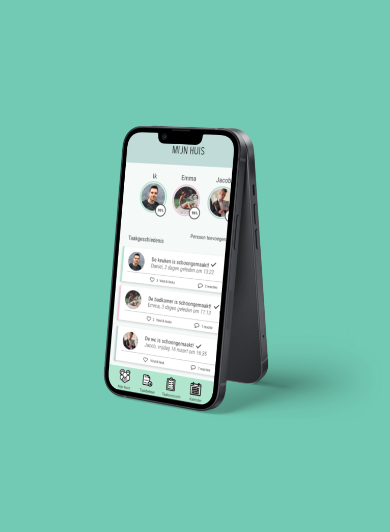
For this project, my classmate and I designed an application called "WieDoetWat" (Who Does What in English). This digital cleaning schedule is aimed at students who share a living space with roommates. Our goal was to create a solution that would address the common issues roommates face when dividing and completing household chores. WieDoetWat provides an easy and effective solution for roommates who struggle with completing shared household tasks.
As the UX and UI designer on this project, I played a significant role in ideating the concept, creating the brand identity, designing the user interface, and developing the prototype. This included designing the logo and icons, establishing the color scheme, creating screen layouts, developing visual content for screens, and building an interactive prototype using Adobe XD and ProtoPie.
To create this design, I utilized several UX methods to ensure that the final product was user-friendly and effective. First, I conducted user research to understand the pain points that users experience when managing household chores with roommates. This research helped us to identify the key features and functions that we needed to include in our application to address these issues.
Next, I created user personas to represent the different types of users who would be using our application. These personas helped us to understand the unique needs and preferences of our target audience and informed the design decisions we made.
I also created wireframes and prototypes to test and refine our design. By creating low-fidelity wireframes, we were able to quickly iterate on our design ideas and get feedback from users before investing too much time in the final design. The interactive prototype allowed us to simulate the user experience and test the usability of the application.
Finally, I conducted usability testing to ensure that the final product was intuitive and easy to use. By observing how users interacted with the application, we were able to identify any pain points or areas that needed improvement and make necessary changes to improve the user experience.
By using these UX methods, we were able to create a design that met the needs of our users and provided an effective solution to the challenges of managing household chores with roommates.
Technology Adobe Creative SuiteYear 2017Histoury
Interactive MediaI, along with three other classmates, was assigned by Erfgoed Gelderland to develop an interactive concept with relevant content for a museum, archive, or historical organization supported by Erfgoed Gelderland. All cases aimed to make the history of Gelderland more exciting, relevant, and interesting through interactive media.
We chose the case of Erve Eme, an open-air museum that tells the story of how people lived in the early Middle Ages. Our task was to create a product that would attract more visitors from the city center of Zutphen to Erve Eme, as the museum is located outside the city center and often overlooked.
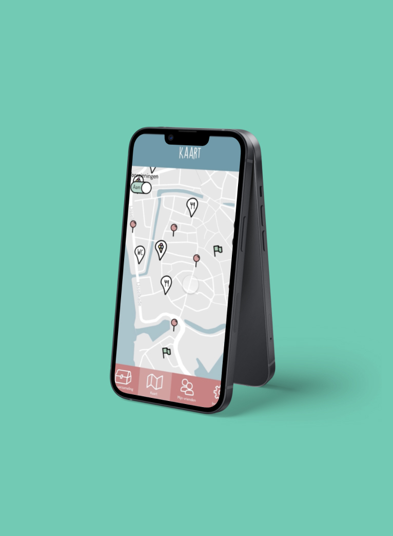
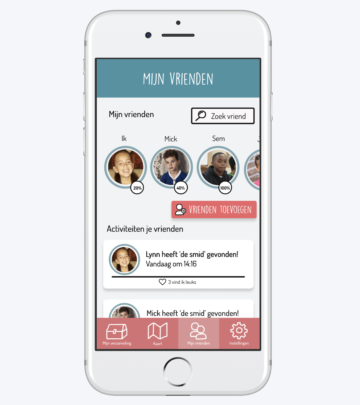
Our concept was Histoury, a digital scavenger hunt with augmented reality where children would search for historical characters in the city center of Zutphen and Erve Eme. These characters needed to be "brought back" to Erve Eme, but first, they had to be collected. Children would use a map, a compass, and hints in the app to navigate. Wooden signs were hidden throughout the city center, and when users found and scanned them, an animation of a character providing information would appear. Then a question would follow. After collecting all characters, they would receive a discount voucher and could experience the historical characters in real life at Erve Eme.
During the project, I focused on research, concept development, creating the visual identity, designing the screens, and building the prototype. I used ProtoPie, a popular tool for UX designers, to create the prototype.
As a UX and UI designer, I used various UX methods to ensure that Histoury would be a high-quality interaction design that would meet the needs of its users. The main target group was kids about the age of 8 to 12 years old.
Firstly, I conducted user research to gain insights into the target audience's behavior, needs, and pain points. This research informed the creation of personas, which helped me empathize with the users and design for their specific needs and preferences.
Next, I employed the ideation process to generate and evaluate multiple design ideas. I then used wireframing and prototyping to visualize and test these ideas before committing to a final design.
To ensure that the final design was intuitive and user-friendly, I conducted usability testing throughout the design process. This helped identify any pain points or areas for improvement, which I could then address through iterative design.
Additionally, I used visual design principles to create a cohesive and appealing visual identity for the app. The colors, typography, and graphics were chosen based on user research, ensuring that they would appeal to the target audience.
Overall, by employing these UX methods, I was able to create a high-quality interaction design that met the needs and preferences of its users, resulting in an engaging and enjoyable user experience.
Technology Adobe Creative SuiteYear 2018Contact
Get in touchThank you for your message!
I will get back to you as soon as possible.


